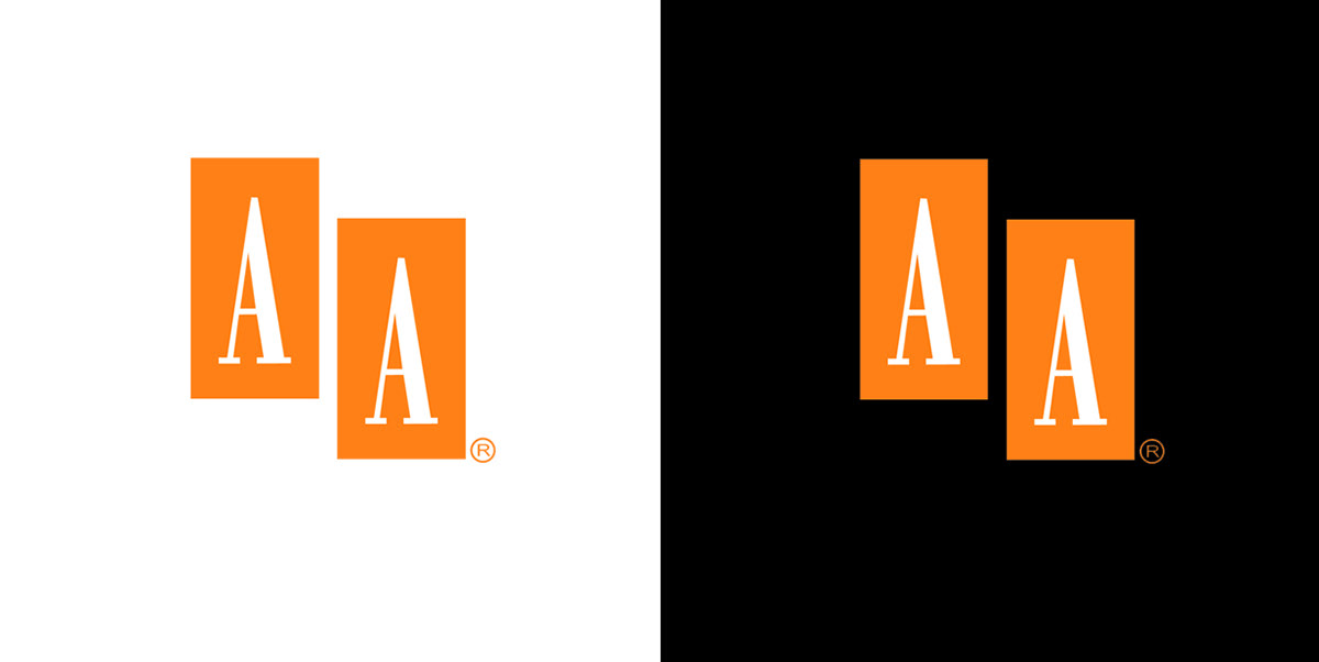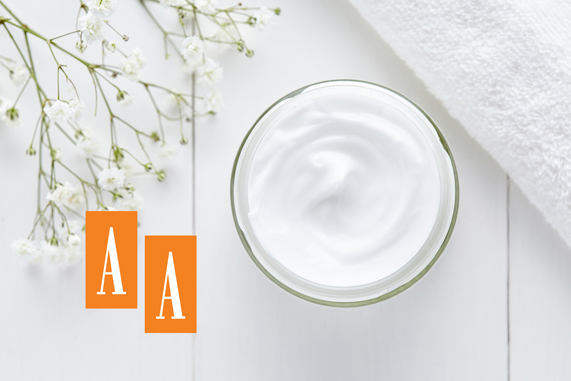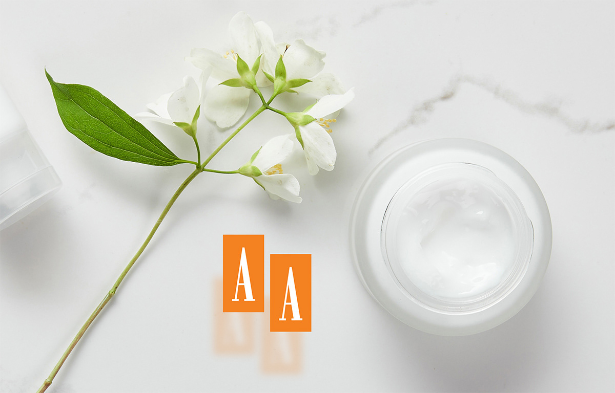

The "AA" brand project was based on one of the existing products of Oceanis S.A. More than 30 years ago, at the request of the cosmetics company Oceanic S.A., an innovative concept for brand communication and launch on the Polish cosmetics market was developed by selling exclusively in pharmacies as a cream for skin problems and as a remedy for ageing. In line with the communication assumptions, a visual form of the AA logo was created, referring to the medicine in its form. By using "golden proportions" in the design, the impression of harmony and peace was created, and the positive character was complemented by the colour orange, a colour with a uniform, positive hue.
The concept not only proved successful, but also became Oceanic's flagship and brand, which was extended to other brandy derivatives.
Scope of work:
Creation of a communication concept and a sales strategy, development of a visual identification
Creation of a communication concept and a sales strategy, development of a visual identification