
At the invitation of the German company InnovationLab GmbH, we took care of the branding of their new brand FLEXOO.
FLEXOO (an independent spin-off company of InnovationLab) primarily offers modern electronic solutions - large-area printing of touch sensors. We love challenges like this! We approached the design with great excitement because this is the first time we are supporting a modern technology brand.
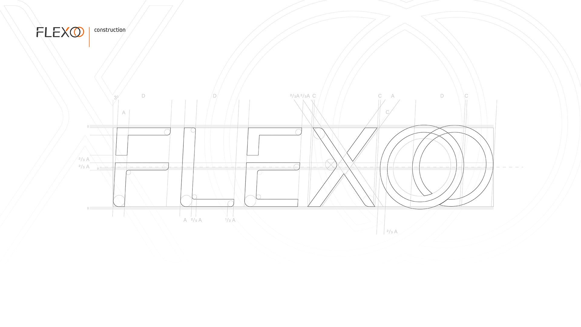
Based on the assumptions of the communication and marketing determinants of the client's strategy, we developed the concept of the brand logo, focussing on the way it is read. This process is very important because it influences the speed of perception of signs and the ease with which they are remembered and understood. Thank you to the use of knowledge from the field of psychology and physiology of viewing in the design process, the logo becomes an instrument with a precise message aimed at a specific recipient, and not just a sign that distinguishes the brand from others.
FLEXOO (an independent spin-off company of InnovationLab) primarily offers modern electronic solutions - large-area printing of touch sensors. We love challenges like this! We approached the design with great excitement because this is the first time we are supporting a modern technology brand.
Based on the assumptions of the communication and marketing determinants of the client's strategy, we developed the concept of the brand logo, focussing on the way it is read. This process is very important because it influences the speed of perception of signs and the ease with which they are remembered and understood. Thank you to the use of knowledge from the field of psychology and physiology of viewing in the design process, the logo becomes an instrument with a precise message aimed at a specific recipient, and not just a sign that distinguishes the brand from others.
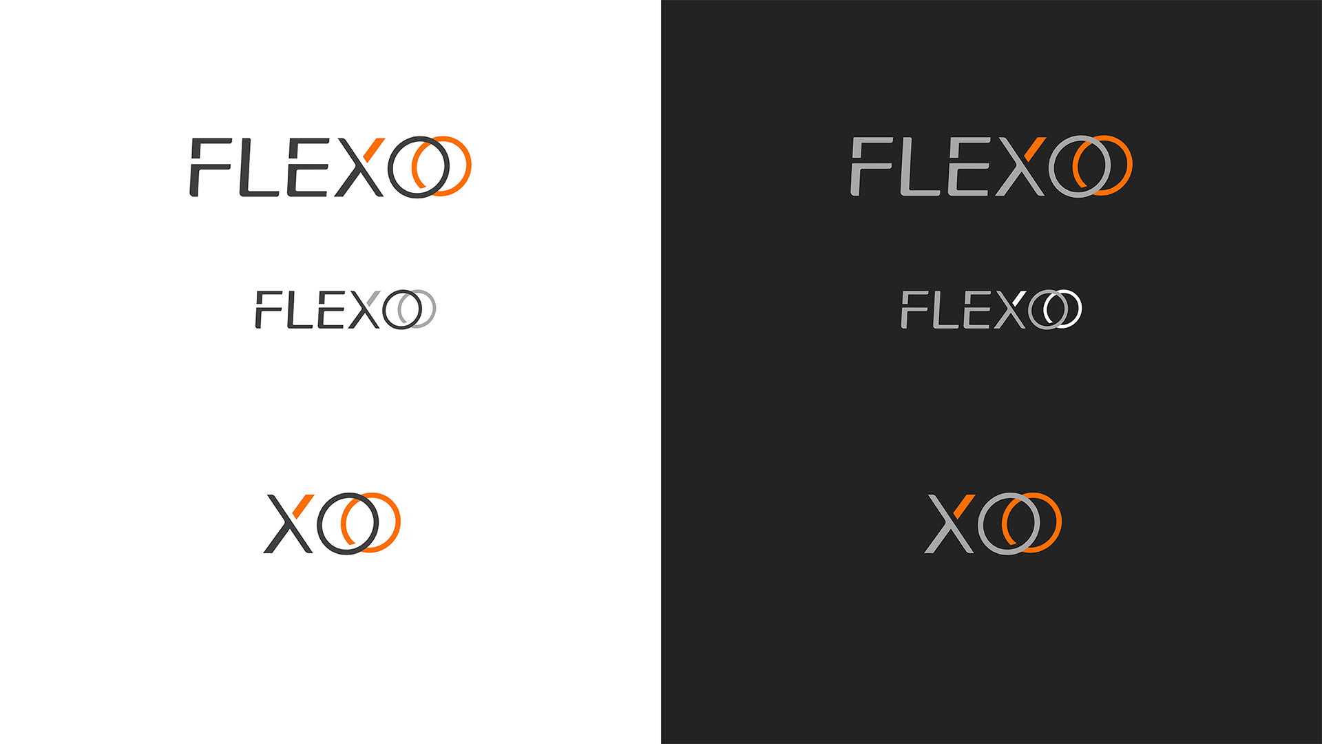
By defining the strengths of the logo, we created its special shortened version in the form of the XOO signet ring.
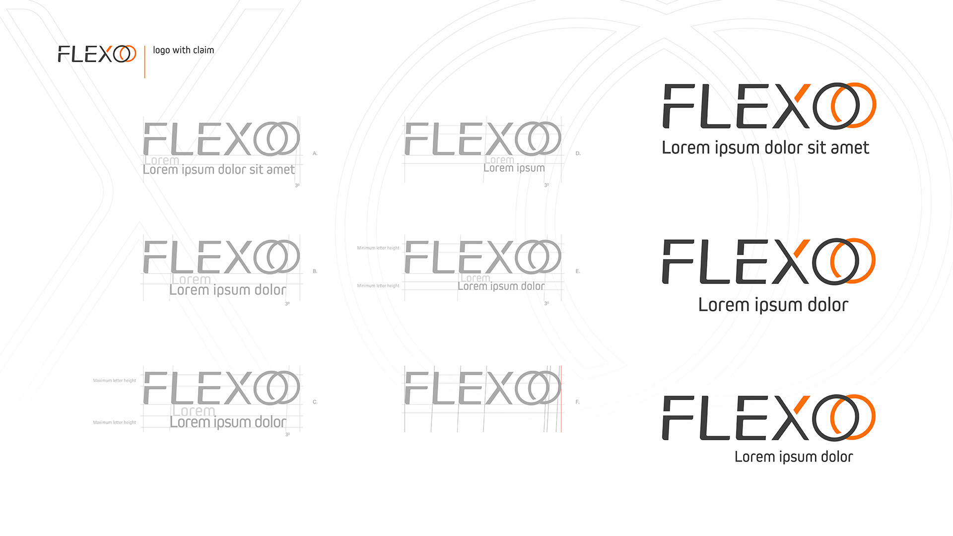
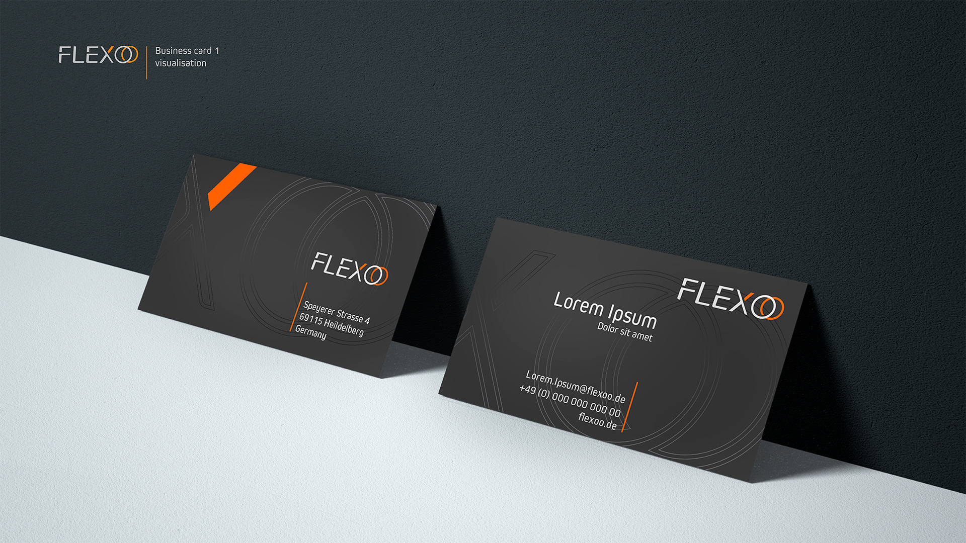
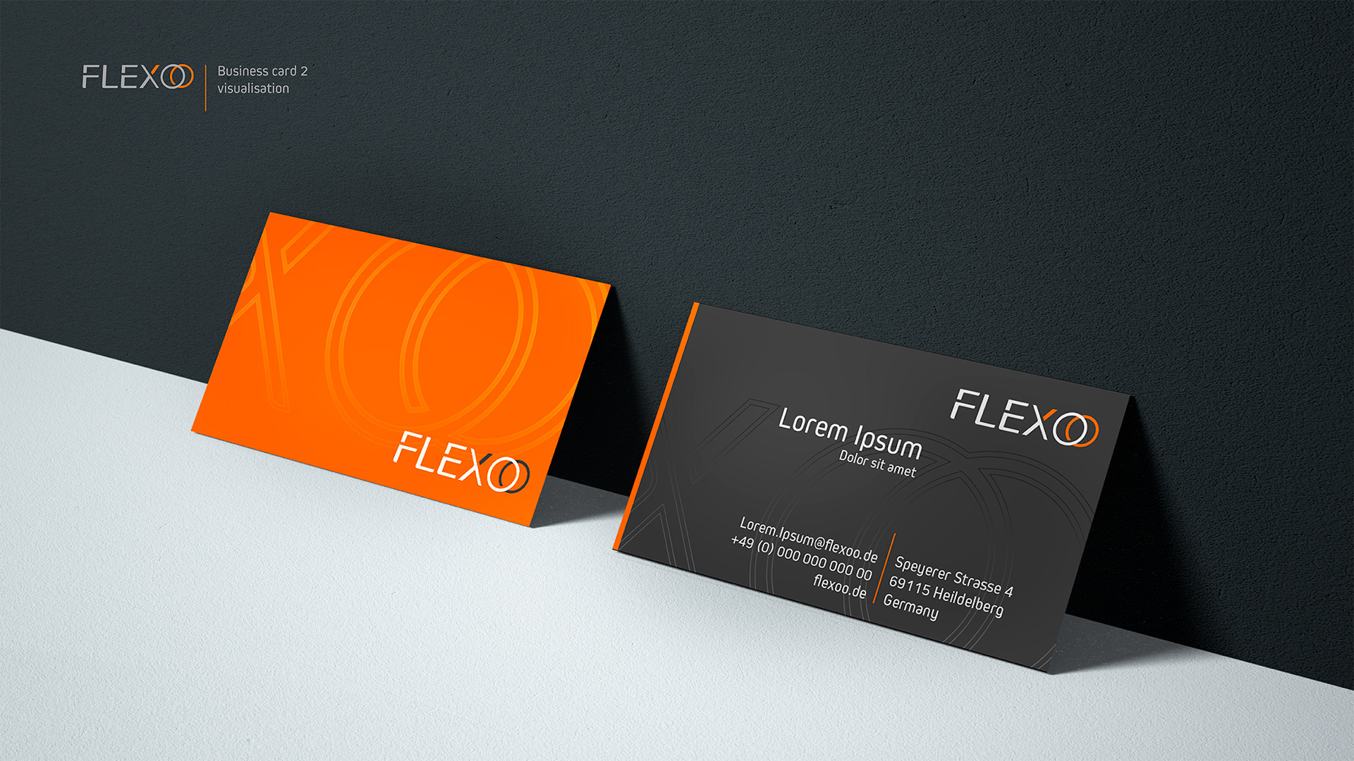
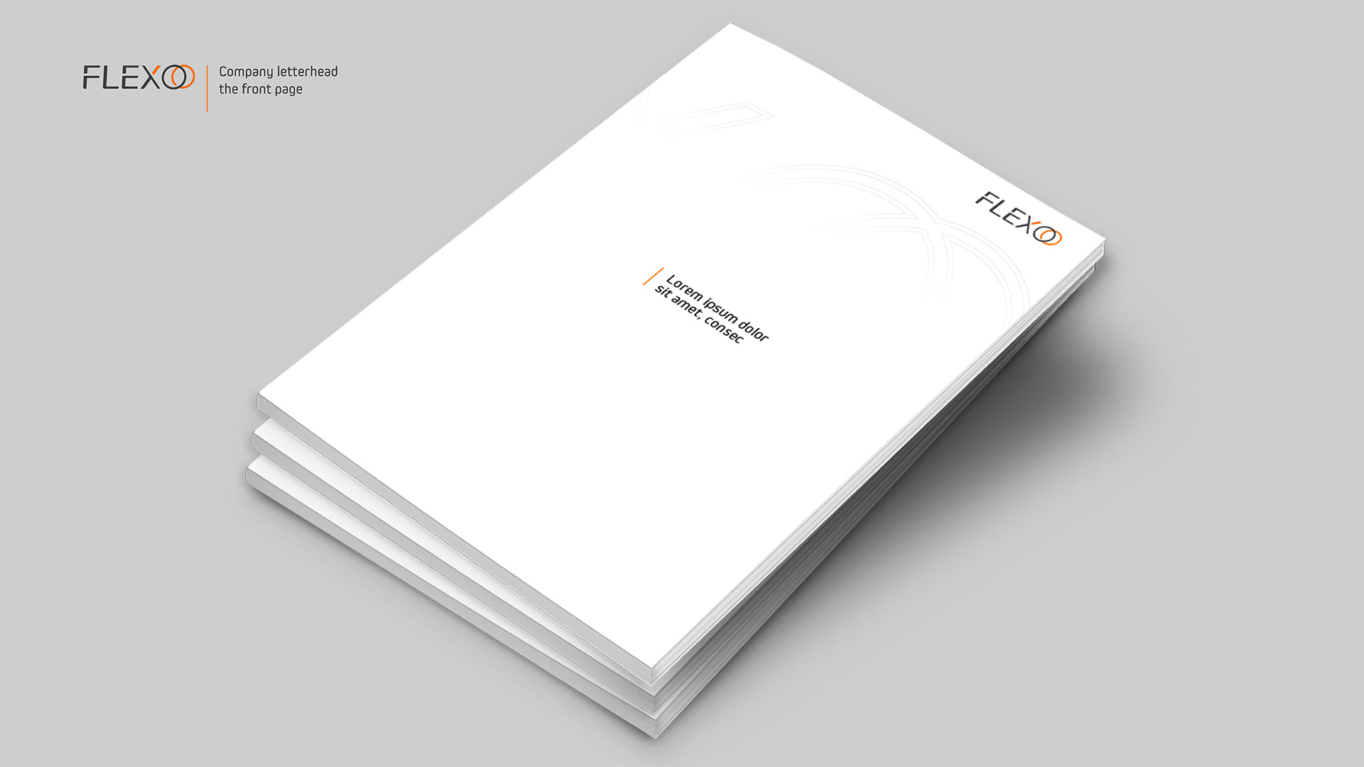
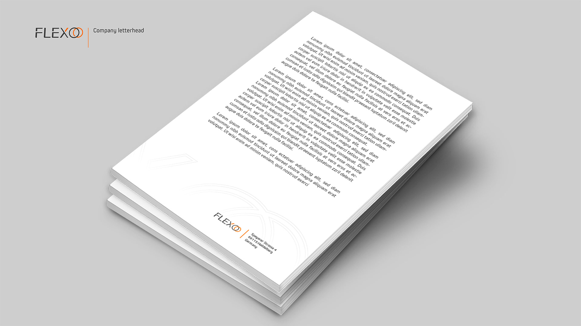
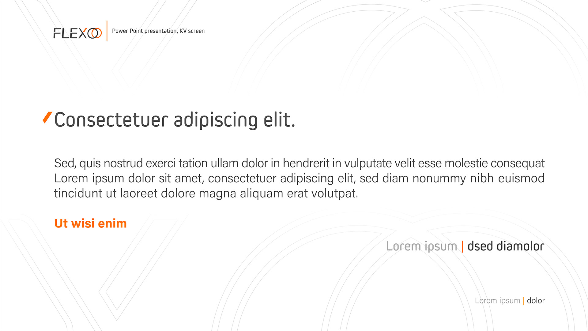
At the end of the work, a system for identifying the brand was created, together with elements supporting communication and a set of templates for the company's representative materials, which were summarised in the form of a book on the use of the brand - the Brand Manual.
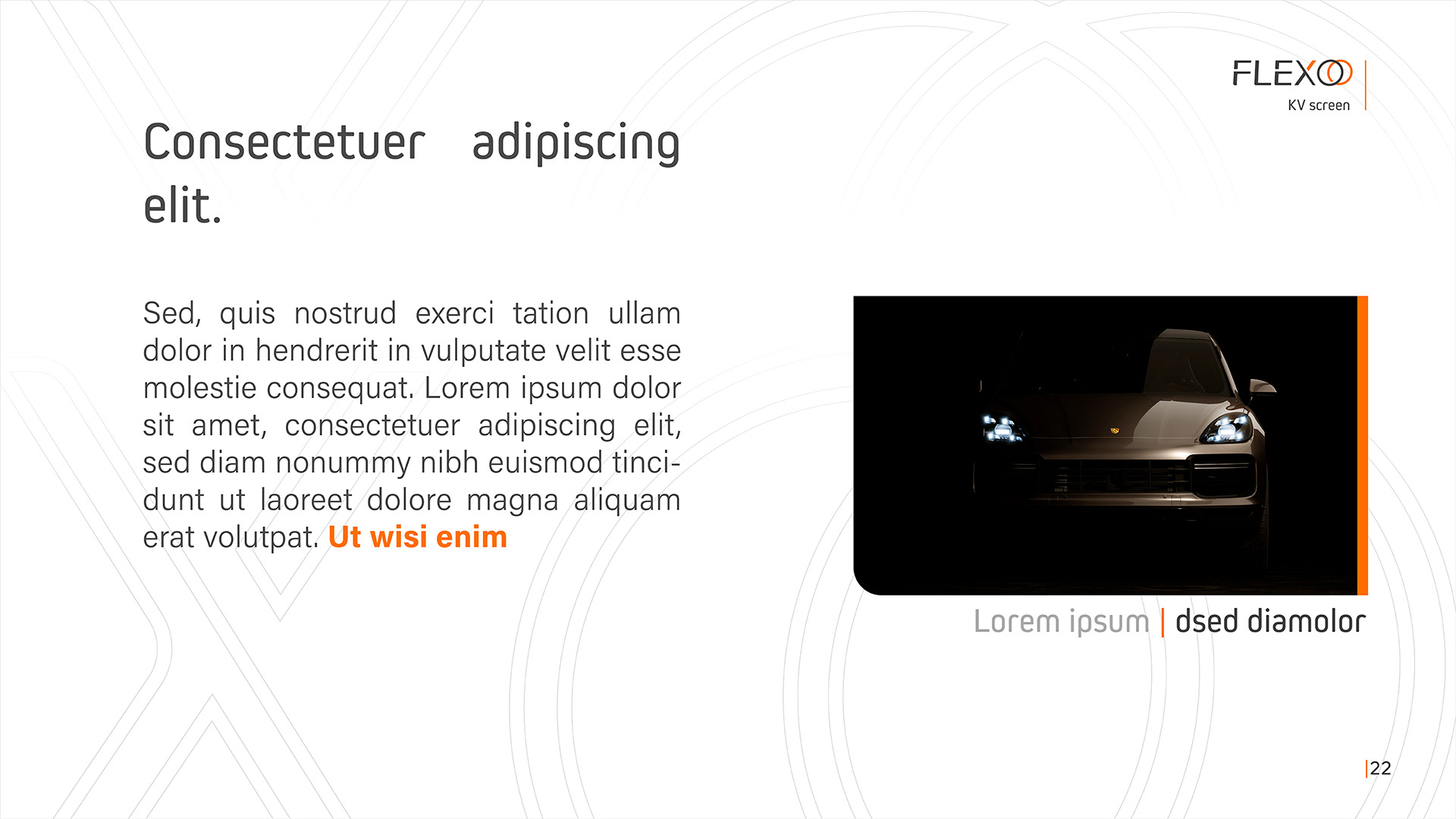
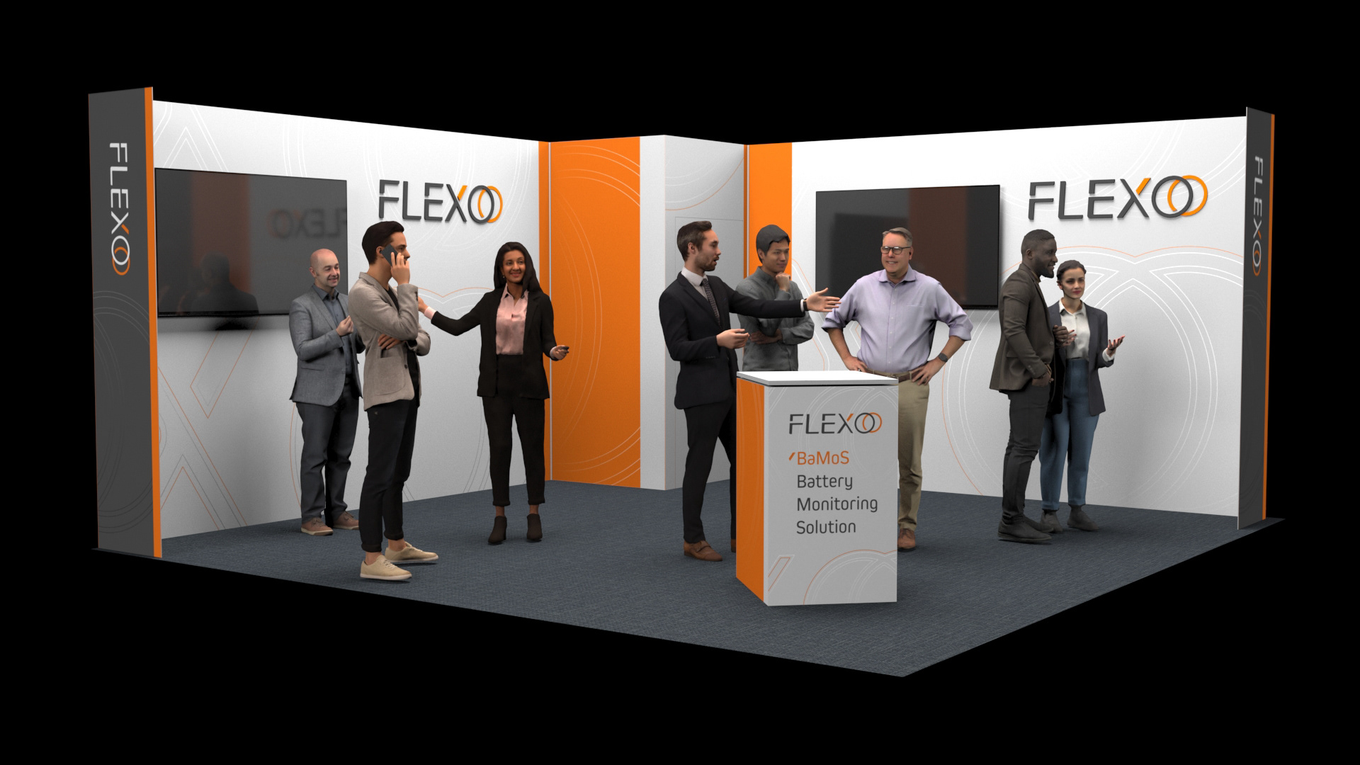
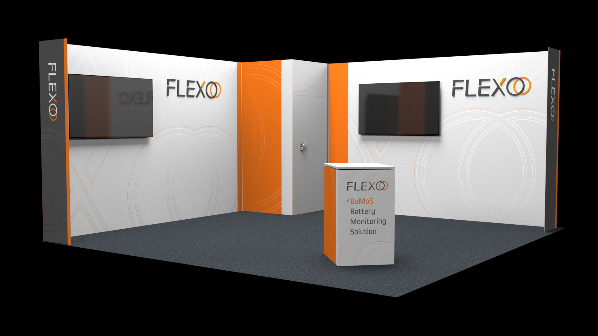
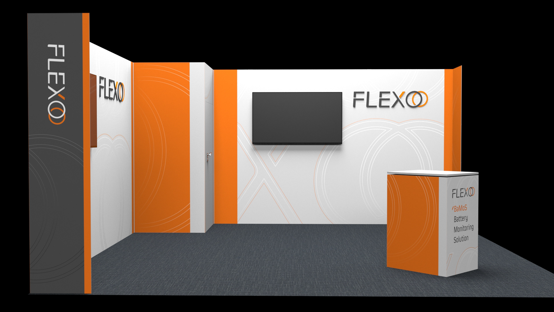
In response to the need to present the company at technology fairs, we developed a concept and graphic design for the stand. We also created an image animation of the new logo, showcasing its technical and modern design.
In response to the need to present the company at technology fairs, we developed a concept and graphic design for the stand. We also created an image animation of the new logo, showcasing its technical and modern design.
Scope of work:
Concept and development of a logo, its special version in the form of a signet, development of an identification system to support marketing communication, development of rules for the use of the logo in the brand book, concept and image animation - brand launch, stand design for trade fairs
Concept and development of a logo, its special version in the form of a signet, development of an identification system to support marketing communication, development of rules for the use of the logo in the brand book, concept and image animation - brand launch, stand design for trade fairs