We love design even more when we have a specific task to solve. In this case, it was a rebranding of a brand that wanted to expand its offer to western markets, especially Germany, and to appear at trade fairs, while at the same time convincing western customers not only of its experience and professionalism, but above all of the punctuality and speed of order processing.
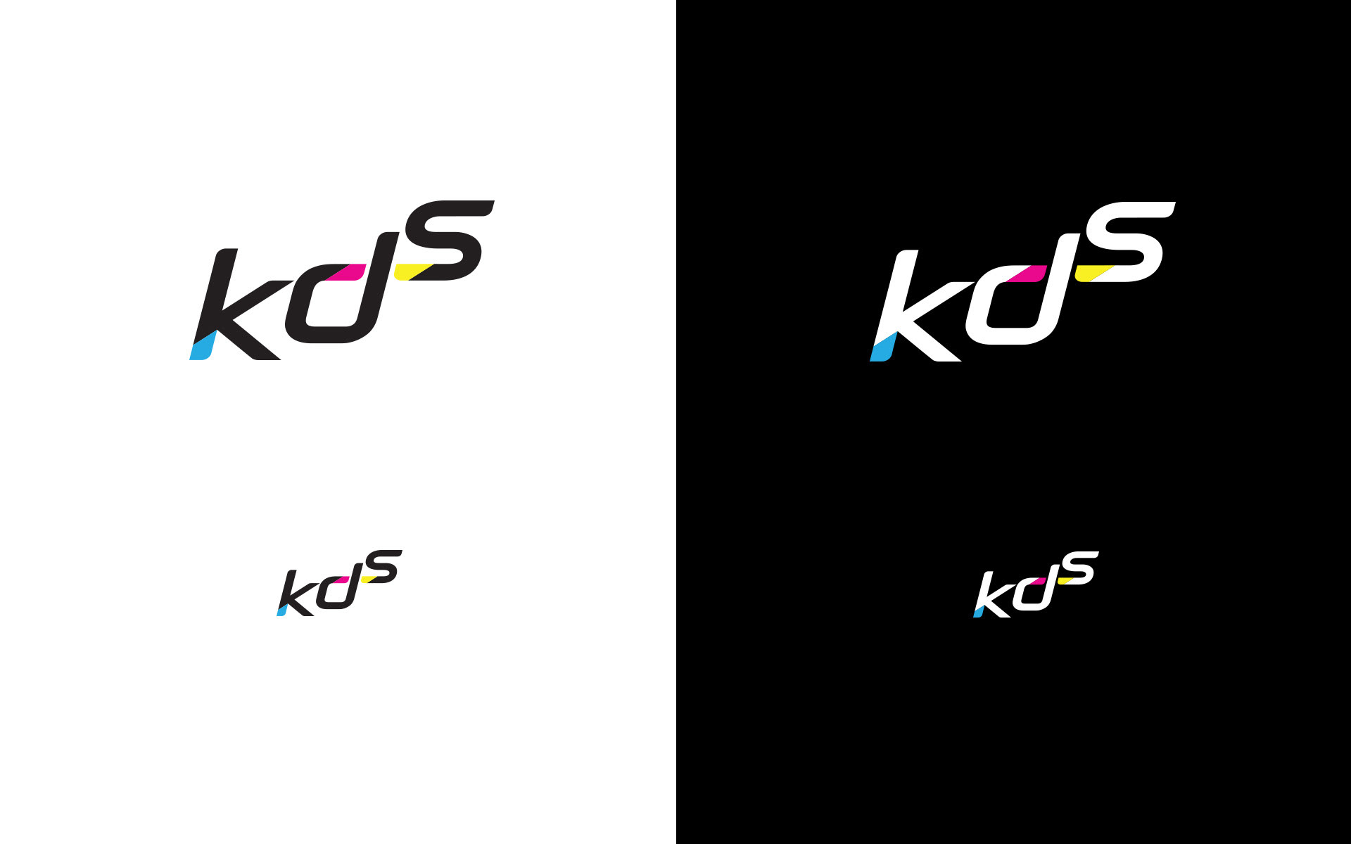
The changes were driven by the need to pre-define the future marketing communication of KDS - a printing company for labels, tickets and stickers.
We limited the communication message to emphasising brand attributes such as: Quality, Development, Dynamism and Trust. Therefore, we chose appropriate visual solutions when designing the graphic sign.
Specially designed letters that form the beginning emphasise growth and dynamism. Another visual treatment - the sporty character of the font - is intended to convince the recipient and create trust in this attribute. The colours used: cyan, magenta and yellow are an integral part of the print palette and are indicative of the industry.
The entire logo composition ends with a complementary slogan that reinforces the feeling of a stable, trustworthy company.
Following the change in identification, we developed a brand manual - a set of rules for using the logo, along with patterns and colours that reinforce the communication.
Working further with KDS, we were asked to create sample graphics to design a new website for the company.
Following the change in identification, we developed a brand manual - a set of rules for using the logo, along with patterns and colours that reinforce the communication.
Working further with KDS, we were asked to create sample graphics to design a new website for the company.
Scope of work:
Supporting the KDS marketing team in defining brand communication for foreign markets, logo design and brand manual
Supporting the KDS marketing team in defining brand communication for foreign markets, logo design and brand manual