The Plagiat brand is associated with quality, protection, knowledge and reliability on the Polish market.
Our task was to analyse the existing corporate branding in terms of the theory of vision and, above all, to formulate the identity of the current brand. On this basis, we developed visual indicators and recommendations for the replacement, while maintaining continuity of identification during the planned rebranding process. The end result was the development of a new brand identification system.As a result of the analyses and design process, a new identification was designed, along with the process of reading the sign, so that the rebranding would be an evolution without losing the current recipients.
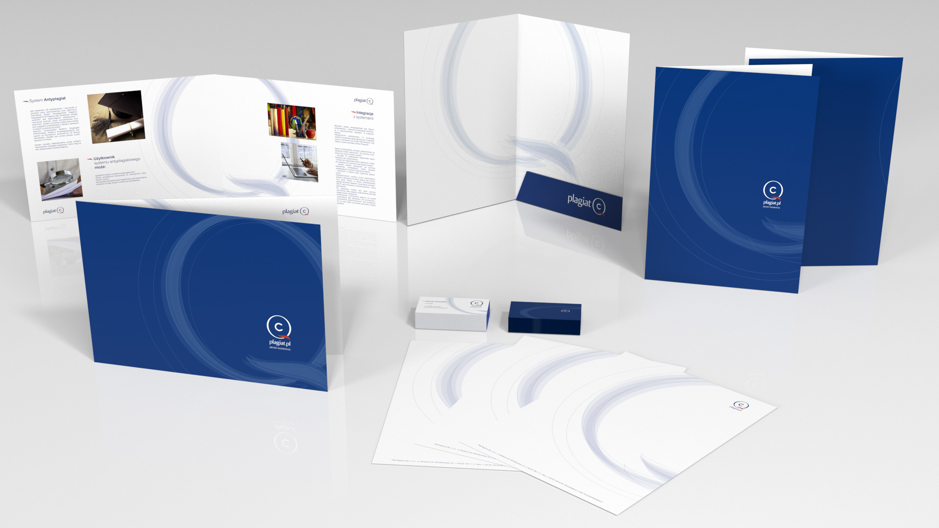
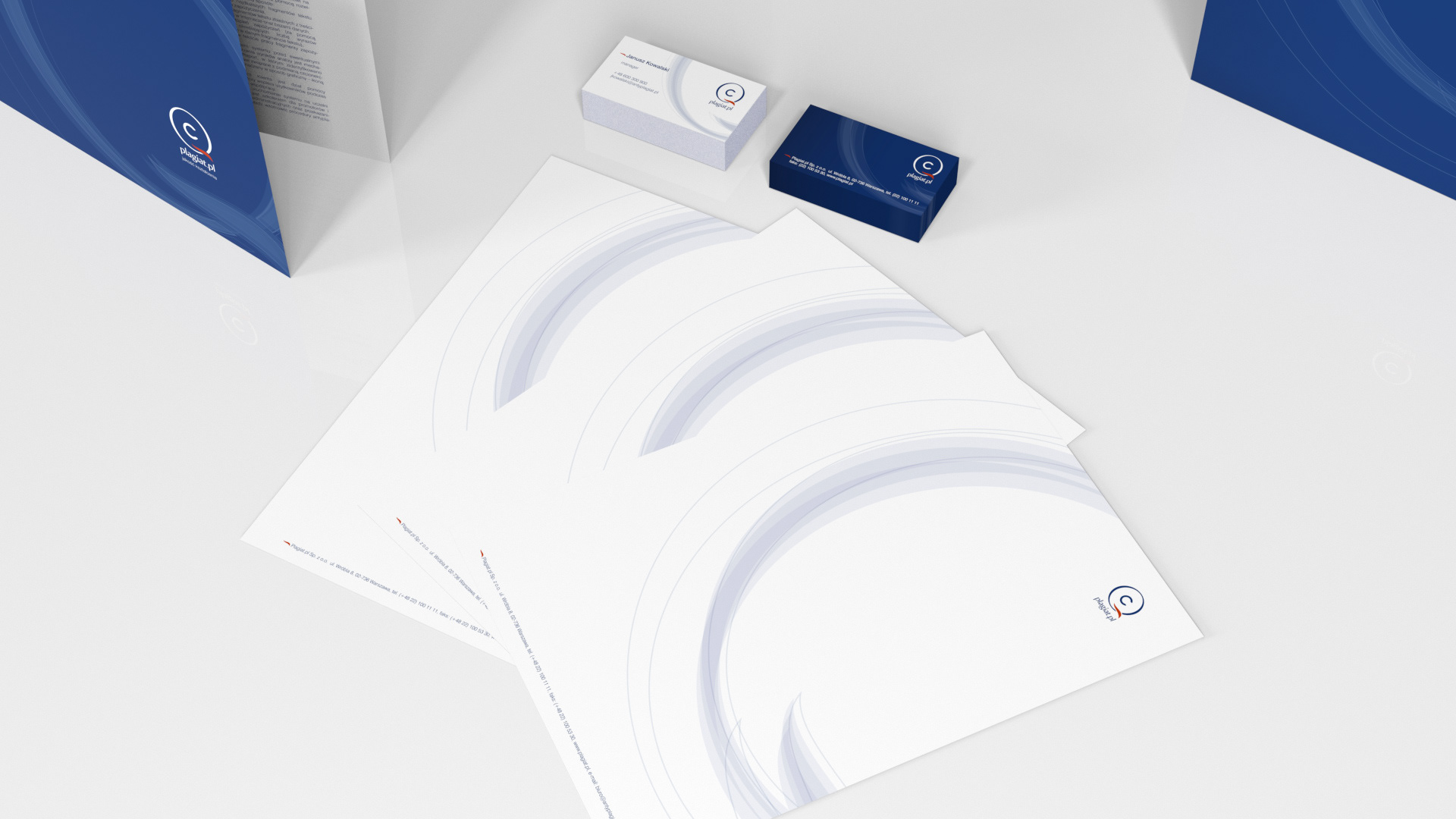
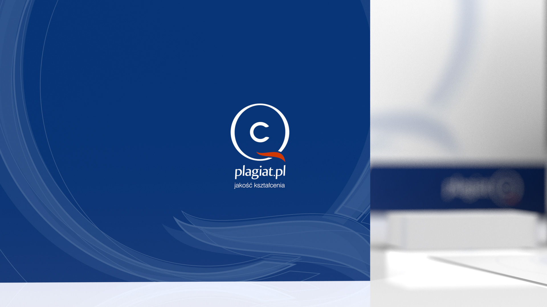
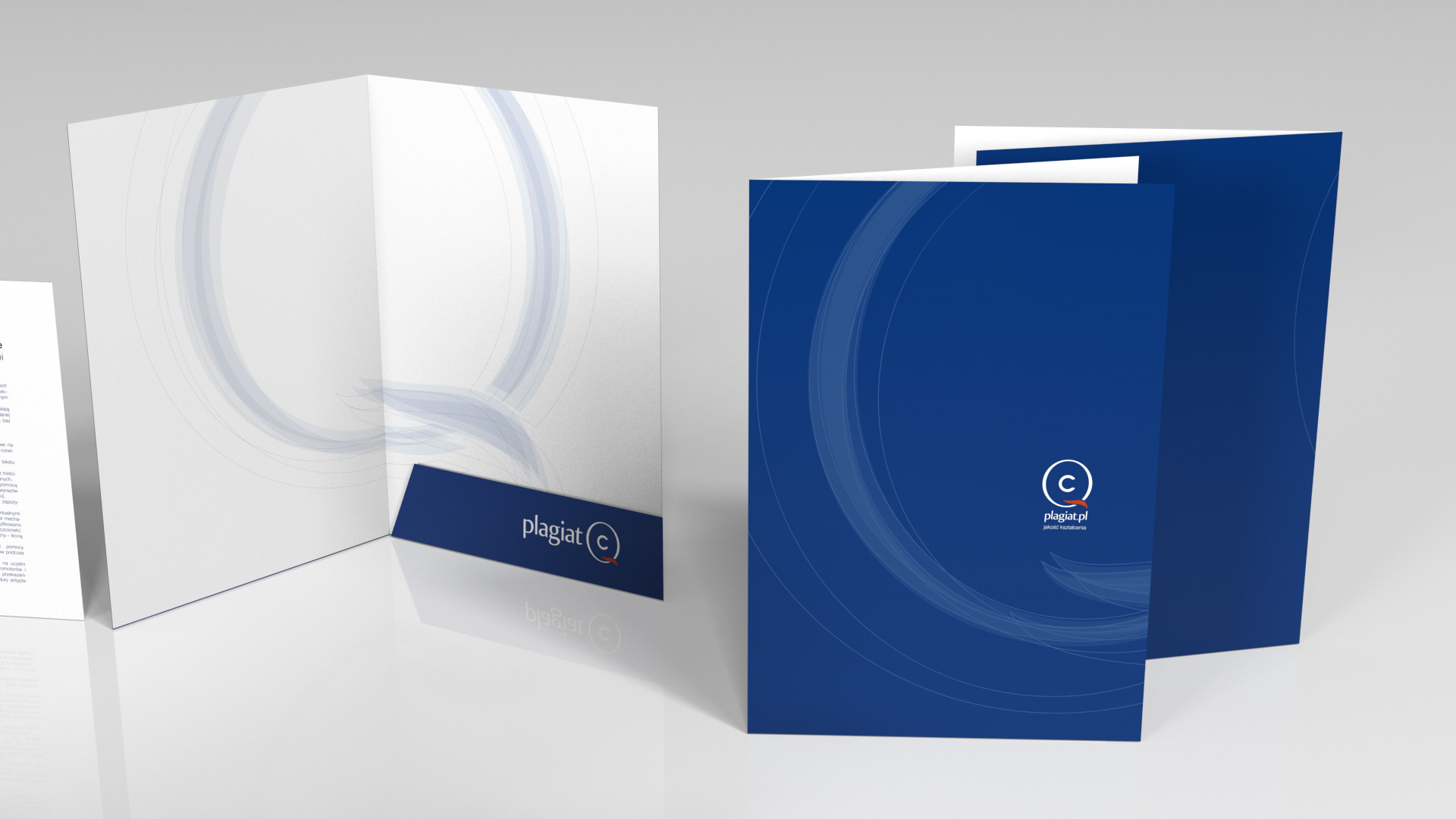
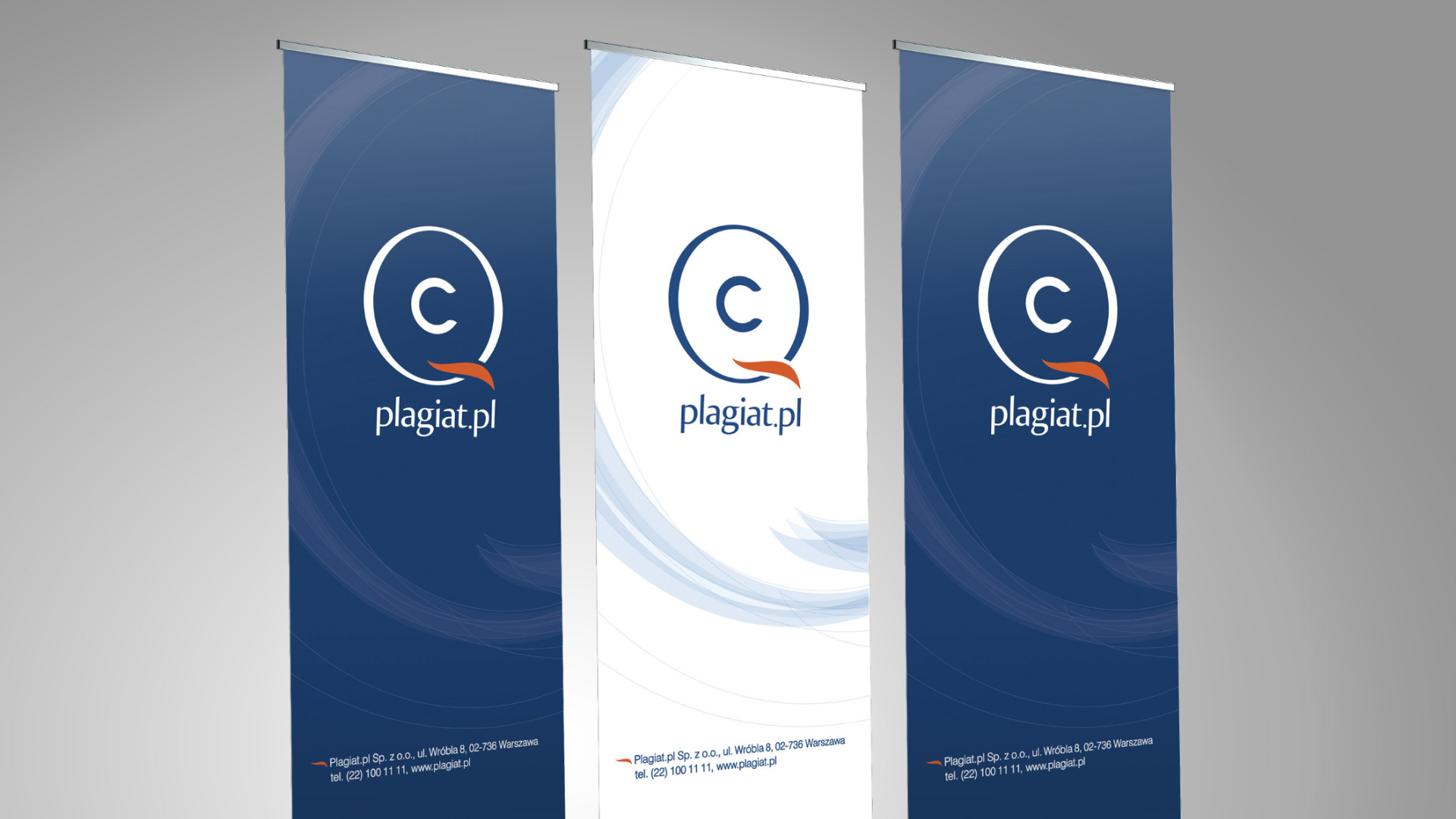
The concept of the graphic sign was based on the combination of the most important brand attributes in the emblem: quality and property protection, which we achieved through the visual combination of the letters "Q" and "C", quality and copyright symbols.
The concept of the graphic sign was based on the combination of the most important brand attributes in the emblem: quality and property protection, which we achieved through the visual combination of the letters "Q" and "C", quality and copyright symbols.
The entire composition was complemented by a specially designed typography that corresponds to the specifications from the analysis of the previous visual material. The colours of the mark were chosen to match the other attributes of the brand. The logo was visually optimised to maximise the quality of the advertising message. A brand manual was created, including visual material. In the next phase of the collaboration and a website.
Scope of work:
Analysis of the actual communication and visual identity of the current identification, development of recommendations and guidelines for the creation of a new graphic form based on the company's development strategy, creation of a logo design and brand manual, design and implementation of a website.
Analysis of the actual communication and visual identity of the current identification, development of recommendations and guidelines for the creation of a new graphic form based on the company's development strategy, creation of a logo design and brand manual, design and implementation of a website.
